
 Photos on your website serve many purposes. They are aesthetically pleasing, break up content, communicate messages visually, and allow readers to see themselves in your world. Unfortunately not all photos are created equal, and the level of quality can either boost a site’s user statistics or obliterate them. In this post we’ll outline what to aim for and what to avoid like the plague when choosing visuals for your site.
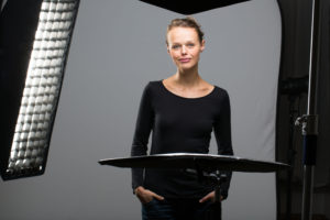
Headshots
In the age of social media it can be tempting to simply take a selfie and slap it online. This is a fine method for profile pictures, but it won’t help your website. When your clients visit your website they want to be assured that you are professional, credible, and trusted. Spending extra for clean, quality headshots is a worthy investment to make. Your headshots should:
- Be conducted by a professional photographer with good references
- Feature the subject (you) dressed as they would for work or an important client meeting, including hair and makeup
- Be shot in a professional or outdoor setting. Don’t do your shoot at the dive bar down the street.
Stock Photography
Most companies don’t spring for 100% custom photography for their entire website. This is where stock photos come in handy, and also where quality really counts. We’ve all seen the generic white, older man in a boardroom in a sharp suit surrounded by his placid looking employees. While they convey the right sentiment, visitors may experience the “I’ve seen this before” sensation we don’t want.
Fortunately stock photography has come a long way and there are literally millions of high-quality, unique images to choose from. Our advice on this point is to communicate the emotions you want your website to evoke with your web team and trust their design expertise.
The Hard Numbers
When imagery is approached in the right way it increases user interaction; conversely bad imagery decreases it. To contextualize this discussion further, we’ve gathered some helpful stats that demonstrate what we’re talking about, or rather what advertising legend and forefather David Ogilvy taught us.
- Placement is Paramount: Where you place your website photos matters nearly as much as the photos themselves. On average, headlines placed below an image are read by 10% more people than headlines above. Additionally, photos placed to the left of copy distracts the reader by messing with the eye’s reading anchor point. Basically, don’t distract your reader with photos.
- Captain Caption: Captions are read 300% more than body copy. That’s a lot! While we all like to imagine our readers are hanging onto every word, they aren’t. They scan headlines, subheads, things in bold, and explanatory information. If you’re going to place a photo within copy, it must be captioned to keep the reader engaged in the rest of the copy.
- Speed Matters: You have to balance image quality with size. Google found that images that load in 0.9 seconds perform 20% worse than photos that load in 0.4 seconds. Everything in moderation, man.